
Microsoft PL-300 - Microsoft Power BI Data Analyst
You need to create the On-Time Shipping report. The report must include a visualization that shows the percentage of late orders.
Which type of visualization should you create?
bar chart
scatterplot
pie chart
The Answer Is:
AExplanation:
Scenario: The On-Time Shipping report will show the following metrics for a selected shipping month or quarter:
The percentage of orders that were shipped late by country and shipping region
Customers that had multiple late shipments during the last quarter
Note: Bar and column charts are some of the most widely used visualization charts in Power BI. They can be used for one or multiple categories. Both these chart types represent data with rectangular bars, where the size of the bar is proportional to the magnitude of data values.
The difference between the two is that if the rectangles are stacked horizontally, it is called a bar chart. If the rectangles are vertically aligned, it is called a column chart.
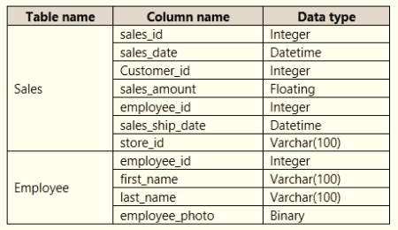
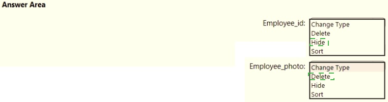
You need to create the semantic model.
Which storage mode should you use for the tables in the semantic model?
live connection
Dual
Import
DirectQuery
The Answer Is:
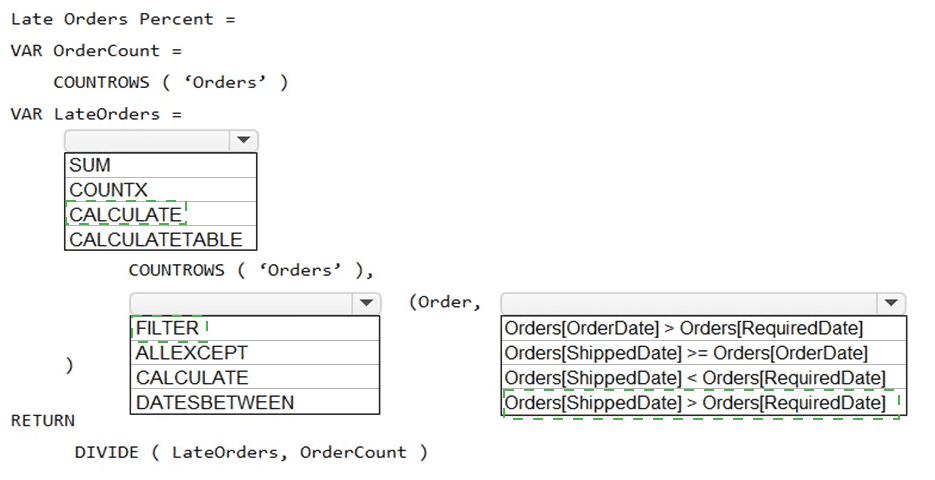
CYou need to create a measure that will return the percentage of late orders.
How should you complete the DAX expression? To answer, select the appropriate options in the answer area.
NOTE: Each correct selection is worth one point.
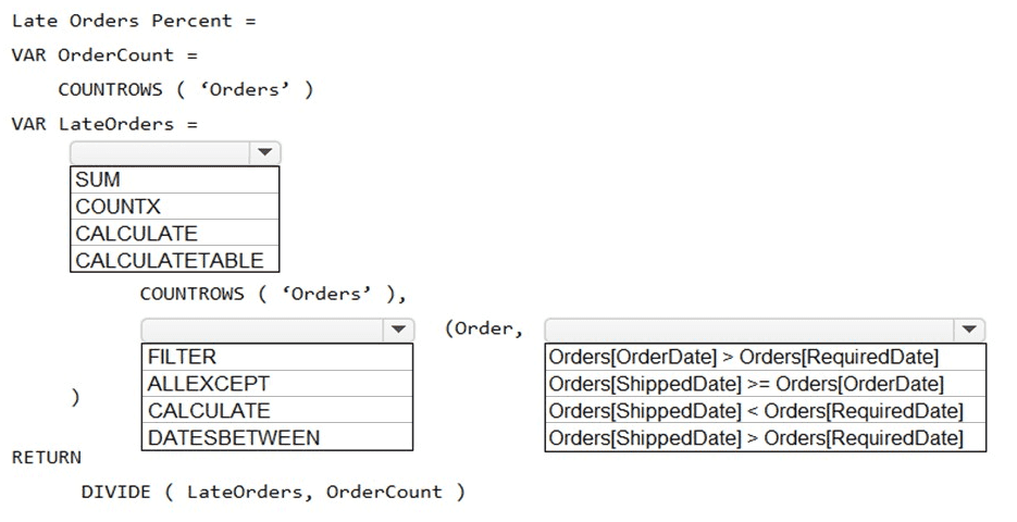
The Answer Is:
Explanation:
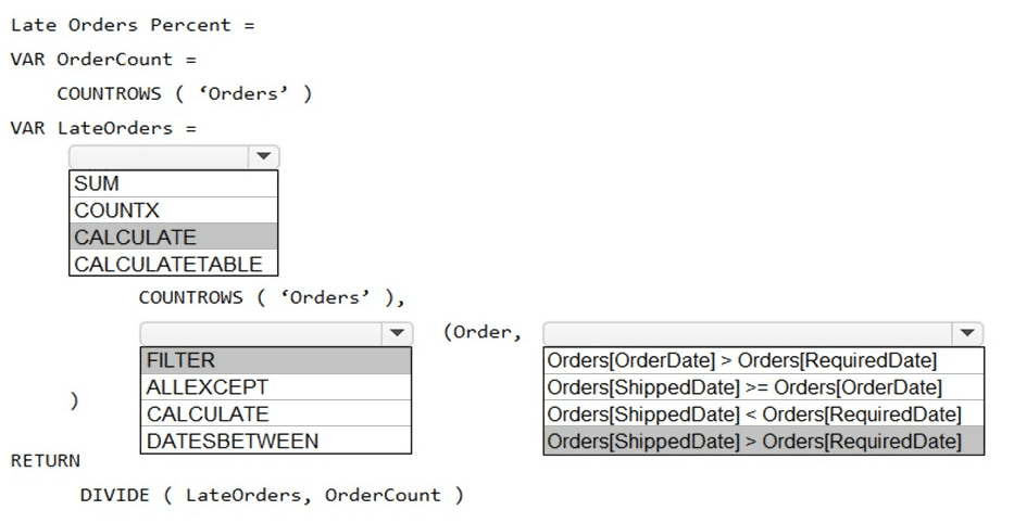
Box 1: CALCULATE
CALCULATE evaluates an expression in a modified filter context.
Syntax: CALCULATE(
Expression - The expression to be evaluated.
filter1, filter2,… (Optional) Boolean expressions or table expressions that defines filters, or filter modifier functions.
Box 2: FILTER
FILTER returns a table that represents a subset of another table or expression.
Syntax: FILTER(